The challenge for a book cover designer is that the cover has to say both “look at me” and “here’s what you can expect inside”. The design can succeed or fail on either or both counts.
Like everyone else, I have opinions on design, including the design of my own book covers. What I don’t have is the skill to design covers myself or the right to determine my own book cover designs. My author contracts make it clear: the publisher decides on the design.
Over the years, publishers have asked for ideas and often my input to help choose between different designs or refinements required on particular designs. On occasion I’ve simply been informed: “Here’s the cover for your new book.”
However, no contract binds me as to what I can say in my own blog, so here are some thoughts about my published works so far.
By way of background: I have a lifelong interest in design – graphic and, to a lesser extent, product design. (Why put pull handles on doors you’re meant to push open?) I’d like to think my aesthetic sense is not the worst, though I’d gratefully bow to the judgement of professionals.
Ekstra dun vir meer gevoel

This design was my basic idea, executed by GG Design, possibly by Herman Koch, though I am not sure. We were limited to a three-colour print job. I suggested the condom motif to fit with the title (“extra thin for more feeling”) and selected the painting to be used inside. I was art critic for Die Burger newspaper at the time, and liked a painting of the Cape Town city hall by Francine Scialom-Greenblatt and asked her if we could use a highly manipulated detail of it. The pink faded badly over the years, but the simple graphics endure.
Wydsbeen

I convinced the publisher to use a painting by one of my favourite painters, Frank van Schaik, for this short novel about the leader of a rebellion in the Cape early in the 18th Century. He did this mixed media work specifically for the cover. It hangs right above the desk I’m using now!
Nobody Dies

This design was my idea, executed by my erstwhile colleague Malcolm Dale, possibly with interference from me. Apparently it didn’t do much for book sales, but I love it. It makes sense to me conceptually and also conveys the tone of the book well. One of my absolute favourite covers.

For the later self-published e-book, another former colleague, Stephen Woodman, did an illustration meant to be seen at small scale on Amazon, etc. Since I can only complain to myself on this one, I won’t!
No-Brainer

Stephen Woodman also did the illustration and design for this self-published book. Strong graphics! Again, the final decision was mine. This was meant to be the first book in a series of commercial “Jules Dijkstra” mysteries, but the idea died halfway through book 2.
ʼn Ander mens


The Afrikaans translation of Nobody Dies has a far less impactful cover than the original Random House NZ book. I had no real input into this one, and have no real opinion on it either. The publisher decided to push the Namibia angle with this touristy library pic of Sossusvlei. Design by Michiel Botha. The reprint was adapted slightly to use the consistent visual styling of my name the publishers had come up with later, and to add the award it had won.
Half of One Thing/Halfpad een ding


My suggested cover idea for this Boer War tale of divided loyalties was a closeup of a Boer jacket on one side buttoned onto a British tunic on the other. I somehow see that seed in this striking design by the late Michiel Botha. This one still impresses me as perhaps the classiest of all my covers.
Hochnamib trilogy


Because I was so impressed with his previous design, I suggested that we use Michiel Botha for the first book, Parts Unknown/Die Vertes In (2018). The result was too bitty for my liking – I’d prefer one strong image. Both the soldier’s face and the female figure are not images I would have chosen.


I suggested a leopard for the cover of Tweegevreet (literally two-faced, English title The Two-Legged Leopard) and the bold way Michiel used this makes this my favourite of the three covers in the series. Michiel’s declining health precluded him from doing the cover of Een of Ander Held (English: Some Kind of Hero) and it was designed by Mike Cruywagen of Nudge Studio, following the established style for the series. I found a good historical reference photo that Mike expertly manipulated for the cover.
This series is my proudest achievement as a writer, but sadly the style of these covers just doesn’t appeal to me. To my mind, it creates the expectation of a Wilbur Smith-type story – which these books aren’t.
Ek wens, ek wens

My suggestion was to somehow use a Rubik’s cube and an angel on the cover. Designer Dale Halvorsen (“Joey Hi-Fi”) took a leap into the stratosphere instead, delivering this fantastic design. It not only has shelf impact, but also conveys a sense of the book’s tone, and even literal depictions of scenes from the book! I could not wish for something better. Another favourite.
I Wish, I Wish

The English version of the above delivered yet another appealing cover. I like the graphic simplicity and retro look of Meg Hamilton’s design. It reminds me a bit of the great designs Black Sparrow Press did for Charles Bukowski’s books.
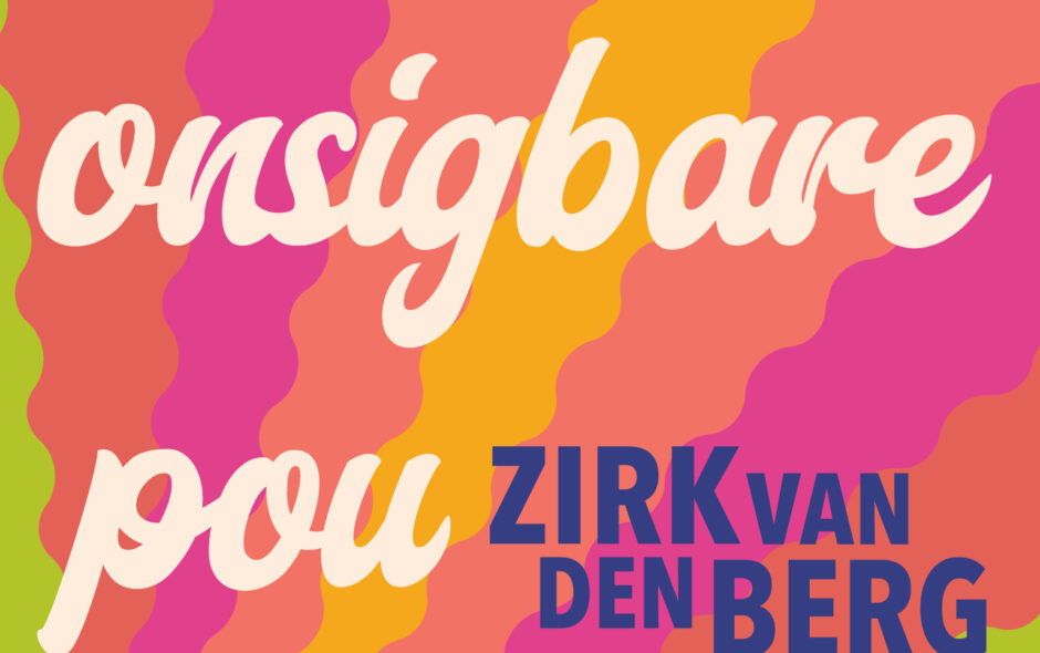
Die onsigbare pou

The title refers to an invisible peacock. Initially, I was taken aback by the bold approach from designer Russell Stark of Publicide. The visual impact is immediate, but it took a while longer to appreciate how subtle and smart this design actually is. The aesthetic is perhaps more 1970s than the two following decades when the book events take place, but I love it all the same.
