BEING A WRITER

Telling a book by its cover

Kwela, 2022

The challenge for a book cover designer is that the cover has to say both “look at me” and “here’s what you can expect inside”. The design can succeed or fail on either or both counts.

Like everyone else, I have opinions on design, including the design of my own book covers. What I don’t have is the skill to design covers myself or the right to determine my own book cover designs. My author contracts make it clear: the publisher decides on the design.

Over the years, publishers have asked for ideas and often my input to help choose between different designs or refinements required on particular designs. On occasion I’ve simply been informed: “Here’s the cover for your new book.”

However, no contract binds me as to what I can say in my own blog, so here are some thoughts about my published works so far.

By way of background: I have a lifelong interest in design – graphic and, to a lesser extent, product design. (Why put pull handles on doors you’re meant to push open?) I’d like to think my aesthetic sense is not the worst, though I’d gratefully bow to the judgement of professionals.

Ekstra dun vir meer gevoel 

Tafelberg SA, 1989

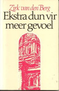
This design was my basic idea, executed by GG Design, possibly by Herman Koch, though I am not sure. We were limited to a three-colour print job. I suggested the condom motif to fit with the title (“extra thin for more feeling”) and selected the painting to be used inside. I was art critic for Die Burger newspaper at the time, and liked a painting of the Cape Town city hall by Francine Scialom-Greenblatt and asked her if we could use a highly manipulated detail of it. The pink faded badly over the years, but the simple graphics endure.


Wydsbeen

Tafelberg SA, 1992

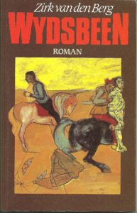
I convinced the publisher to use a painting by one of my favourite painters, Frank van Schaik, for this short novel about the leader of a rebellion in the Cape early in the 18th Century. He did this mixed media work specifically for the cover. It hangs right above the desk I’m using now!


Nobody Dies

Random House NZ, 2004

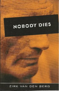
This design was my idea, executed by my erstwhile colleague Malcolm Dale, possibly with interference from me. Apparently it didn’t do much for book sales, but I love it. It makes sense to me conceptually and also conveys the tone of the book well. One of my absolute favourite covers.


Say Books NZ, 2013

For the later self-published e-book, another former colleague, Stephen Woodman, did an illustration meant to be seen at small scale on Amazon, etc. Since I can only complain to myself on this one, I won’t!


No-Brainer

Say Books NZ, 2011

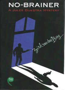
Stephen Woodman also did the illustration and design for this self-published book. Strong graphics! Again, the final decision was mine. This was meant to be the first book in a series of commercial “Jules Dijkstra” mysteries, but the idea died halfway through book 2.


ʼn Ander mens 

Kwela SA, 2018
Kwela SA, 2013

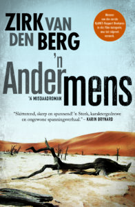
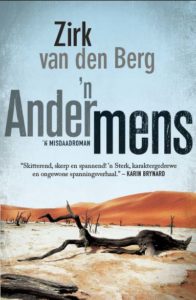
The Afrikaans translation of Nobody Dies has a far less impactful cover than the original Random House NZ book. I had no real input into this one, and have no real opinion on it either. The publisher decided to push the Namibia angle with this touristy library pic of Sossusvlei. Design by Michiel Botha. The reprint was adapted slightly to use the consistent visual styling of my name the publishers had come up with later, and to add the award it had won.

Half of One Thing/Halfpad een ding

Penguin SA, 2014
Penguin SA, 2014

My suggested cover idea for this Boer War tale of divided loyalties was a closeup of a Boer jacket on one side buttoned onto a British tunic on the other. I somehow see that seed in this striking design by the late Michiel Botha. This one still impresses me as perhaps the classiest of all my covers.


Hochnamib trilogy

Kwela SA, 2018
Kwela SA, 2018

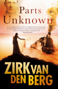
Because I was so impressed with his previous design, I suggested that we use Michiel Botha for the first book, Parts Unknown/Die Vertes In (2018). The result was too bitty for my liking – I’d prefer one strong image. Both the soldier’s face and the female figure are not images I would have chosen.


Kwela, 2021
Tweegevreet (Kwela, 2020)

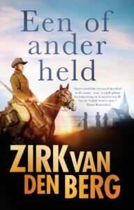
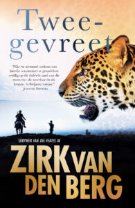
I suggested a leopard for the cover of Tweegevreet (literally two-faced, English title The Two-Legged Leopard) and the bold way Michiel used this makes this my favourite of the three covers in the series. Michiel’s declining health precluded him from doing the cover of Een of Ander Held (English: Some Kind of Hero) and it was designed by Mike Cruywagen of Nudge Studio, following the established style for the series. I found a good historical reference photo that Mike expertly manipulated for the cover.

This series is my proudest achievement as a writer, but sadly the style of these covers just doesn’t appeal to me. To my mind, it creates the expectation of a Wilbur Smith-type story – which these books aren’t.

Ek wens, ek wens

Kwela SA, 2019

My suggestion was to somehow use a Rubik’s cube and an angel on the cover. Designer Dale Halvorsen (“Joey Hi-Fi”) took a leap into the stratosphere instead, delivering this fantastic design. It not only has shelf impact, but also conveys a sense of the book’s tone, and even literal depictions of scenes from the book! I could not wish for something better. Another favourite.


I Wish, I Wish

Cuba Press NZ, 2020

The English version of the above delivered yet another appealing cover. I like the graphic simplicity and retro look of Meg Hamilton’s design. It reminds me a bit of the great designs Black Sparrow Press did for Charles Bukowski’s books.
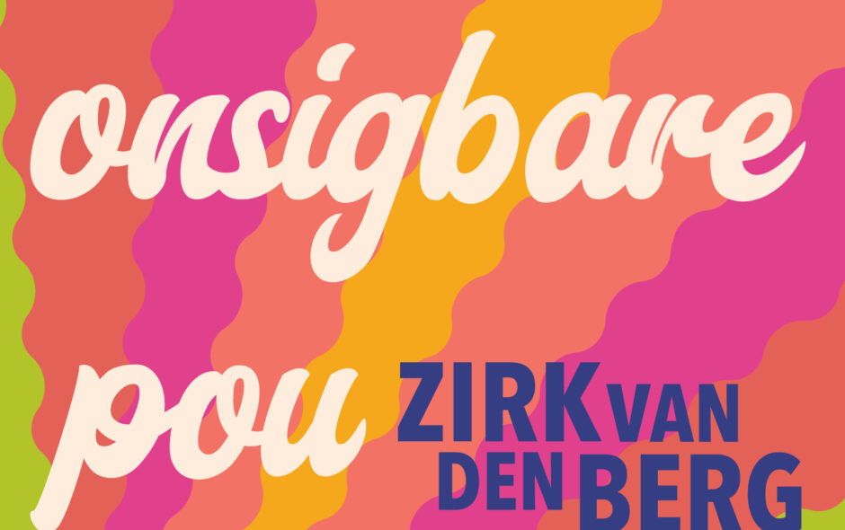


Die onsigbare pou

Kwela SA, 2022

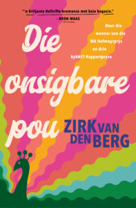
The title refers to an invisible peacock. Initially, I was taken aback by the bold approach from designer Russell Stark of Publicide. The visual impact is immediate, but it took a while longer to appreciate how subtle and smart this design actually is. The aesthetic is perhaps more 1970s than the two following decades when the book events take place, but I love it all the same.

Afrikaans

Wat lesers nie wil hoor nie

My eerste skrywerspraatjie was ʼn teksboekvoorbeeld van hoe dit NIE gedoen moet word nie.

Dit was in die vroeë 1990s, net nadat my kort historiese roman Wydsbeen verskyn het. Frederik de Jager, toe nog by Tafelberg, het my gevra om by Tygerberg Hoërskool met die leerlinge te praat oor skryf of iets dergeliks.

Nou, met die insig wat ek mettertyd ontwikkel het, weet ek dat wat daardie kinders seker wou gehoor het, ’n romantiese vertelling was wat die mite van die muse bevestig – dat ek die een of ander hemelse openbaring gehad het en toe is die boek daar. As daar ’n Aspoestertjie-element kon bykom, soveel te beter, dat ek ’n armsalige sukkelaar was, toe skryf ek hierdie boek en kyk hoe suksesvol is ek vandag! Of dan ten minste iets amusants.

Maar het ek met iets van die aard uitgekom?

Nee. Ek het gepraat oor iets wat my interesseer, eerder as die gehoor. Waarin ek belang stel is skryf. Die proses is waaroor ek wil praat.

Dit was nog voor woordverwerkers, en ek kon met bietjie forensiese navorsing ’n hele rits weergawes van die boek se eerste paragraaf opdiep. Wat ek toe staan en doen, is om vir die bloedjies die een weergawe na die ander van my eerste paragraaf te wys en te verduidelik waarom ek besluit het om hierdie sin uit te haal, of daardie frase te skuif.

(Terloops, anderdag lees ek iemand sê dat Jan van Tonder soveel moeite met sy skryfwerk doen, hy het een boek se eerste sin sewe of twaalf keer oorgeskryf. En toe dog ek: Doen almal dit dan nie?)

Vir interessantheid, Wydsbeen se eerste paragraaf se laaste weergawe lees so:

Wydsbeen op die nok van ’n kerkdak in Zeeland. Die man het sy gereedskap neergegooi. Hy voel in elk geval magteloos. Die verlede druk swaar op sy skouers, waar sy vlerke sou gewees het as hy ’n voël of ’n engel was soos dié wat op hom neerkyk. Daar, dáár sit hy, geboë soos ’n verslane ridder op sy strydros.

Kyk, hier babbel ek al weer oor hierdie stukkie prosa!

Ek hoop ek het sedertdien ’n beter skrywer geword en meen ek sou dalk meer met die opset en vertelling van hierdie storie kon doen, maar moet bely die prosa klink nog vir my na die soort ding wat ek sou skryf.

En nog ’n bekentenis: Ek kon dertig jaar nadat ek dit geskryf het, die begin van hierdie paragraaf tik sonder om in die boek te moet kyk.

Dis omdat ek die stuk soveel keer moes oorlees. Lesers lees ’n boek een keer, miskien twee, by uitsondering drie. Ek het nou getel: Vandat my jongste manuskrip klaargemaak is, het ek hom maklik nog tien keer van voor tot agter gelees. Dis nou buiten om na spesifieke tonele of passasies in afsondering te kyk. En natuurlik, terwyl jy skryf, lees jy elke sin oor en oor.

Daar lê vir my nog een lees van hierdie een voor, as die bladproewe kom. Dan hoop ek om hom neer te lê soos ’n sweterige lieflingshemp na ’n lang dag – met dankbaarheid en waardering, maar ook ’n tikkie weersin.

Die harde werk is deel van die realiteit van skryf. Maar wie buiten ’n skrywer wil dit nou hoor?

BEING A WRITER

I had a police station in Africa, at the foot of Gamsberg…

Gamsberg dominates the landscape in my Hochnamib trilogy.

In 2013, I started with an idea for a miniseries about a policeman in German Southwest Africa. Eight years, three books, 819 pages, 270,000 words later, as I end this project, I cannot help but reflect on this era.

(I’ve been at it longer than any job I held, two thirds of the total years I spent at school. So, yes, an era.)

Brief

Just about the first thing I wrote down back in 2013 was a brief to myself. This hangover from my advertising days helps to crystallize my thoughts and keep me on track. I often refer back to it during the many months or years of writing a book – sometimes amending it, mostly simply reading it to remind me of my original aims and to help me achieve the right frame of mind.

Below is part of the brief I wrote to myself when I embarked on this series:

In the first place, this must come across as a real story about real people in real circumstances. It has to be a juicy story, languidly told, but full of incident, a throwback to 19th Century novels, an exotic adventure crime story, but told by Turgenev or Babel.

This is a book about Romantic dreams versus reality […]

Siegfried Bock is like a Romantic hero from the European novels of my youth, a Nabokov character. He is vain, just, uncompromising, self-possessed, well-meaning, sympathetic to the underdog, sometimes sentimental. He dreams of becoming a real man, a hero […]

There is also a sub-theme of empowerment. The weak and the strong, about ways power is exercised and how power is taken, how the weak takes power.

Looking at it now, I am struck by the literary antecedents I brought up: three Russians whose abilities, frankly, intimidate me. As they should. Turgenev and Nabokov are already canonised. And Babel may just be my favourite short story writer, a master of the craft.

To what extent I have achieved what I had set out to do, I’ll leave for others to judge.

Execution

The creation of such books can be separated into four components:

  1. idea
  2. research
  3. writing
  4. editing.

For some reason, readers tend to be most interested in the first two. As far as I can tell, the questions writers get most often are: “Where do you get your ideas from?” and “What research did you do?”

The question about ideas is hardest to answer – there isn’t a magical formula, no hotline to the muse. It’s different every time. The shortest, most accurate answer is: “I don’t know.” Of course, there is more to say about it, guesses to hazard, perhaps an inkling to share, but I won’t attempt it here. Perhaps some other day.

But I can answer the second question, about research.

To be able to write these books, I had to learn to read a new language, as so much of the research material was only available in German. My knowledge of Afrikaans helped me to find my way with this language, as they are relatively closely related, but it was still a tough task and I never quite mastered German to the extent that I feel I can make grammatically correct sentences in the language, let alone speak it. My hearing comprehension is also too patchy to be really useful. But I can get the gist of a written text.

I ended up reading at least 30 books on Namibian history – a few in Afrikaans, more in English, most in German. This included a facsimile edition of Hans Rafalski’s seminal history of the Landespolizei, Vom Niemandsland Zum Ordnungssstaat. This one is in blackletter font too! I had to make myself a cheat sheet to identify some of the more arcane letters.

The hours of online research I cannot begin to quantify, the time poring over maps and looking at every historical photograph I could find. Without these photographs, there probably wouldn’t have been a book, as they provide wonderful detail and feel.

Having done all this research, I tried to hide it in the text. A novel is not a history book, but a story set against a historical backdrop. Where history had to be conveyed to make sense of events, I tried to weave it into the flow of the narrative, to the best of my ability.

I also undertook two trips to Namibia – not so easy if you live in New Zealand, but I tacked them onto book-related trips to South Africa. Besides, I love it there, in the country of my ancestors, birth and early childhood.

As to the writing itself, for me it is a rollercoaster ride of slog and exhilaration – the most deeply satisfying thing I ever get to do. I appreciate that, while the art and craft of writing occupy my mind much of the time, it is not something I can expect others to appreciate. So, instead, I will simply quantify it: I have written many, many more words than the 270,000 that appeared in print, with all the wrongheaded drafts, abandoned storylines, etc.

And then there is the editing . . . When you’ve reached the end of the story, you’re halfway with the book.

My approach when I write is not that I am putting down the words that will appear in print, but that I am creating text for editing. (That helps keep the incapacitating demon of self-doubt at bay.) Many sentences and paragraphs make it to print unscathed, but as many do not.

You find stylistic problems in a cold rereading of your work, sentences that had lost their way or that jar against their neighbours in an unproductive manner.

There are cul-de-sacs you discover in the editing phase, potential storylines that didn’t pan out. The paragraphs that paved the way for them are now redundant and have to go.

And then there is the repetition. There are all the things you say more than once. You find that you have repeated things in different ways. (See what I did there?)

More worrying, you find discrepancies. In the last book, the Nama warrior Jager suddenly had two canteens, and I couldn’t work out where the second one had come from. It had to be surgically removed in a number of places fairly late into the final preparation of the text. A novel is a conglomeration of so many facts over so many months or years that it is a challenge to avoid contradictions in the text. Across three books, it’s even harder.

On the last book alone, in the home straight before publication, I cut 10,000 words. A few darlings were sacrificed, but it was better for the book. And I saved readers 40 or so minutes of reading time!

An unusual thing that happened in the third book is that while reading the proofs, I realised that there was a significant story detail in my head that I had never put down on paper… To accommodate it in the text at that stage, we had to cut the same number of lines elsewhere on the page, so we didn’t cause a domino effect on subsequent pages.

(This is the only irksome part of editing: Once the book has been set, you cannot do anything that changes line counts. Also, you sometimes have to cut a line simply to help with the flow of text across page breaks. It’s not all aesthetics – the physical medium can affect the text people get to read.)

For me, there is a fifth phase as well: translation. I translated all three books back and forth between English and Afrikaans too, in the hope that I’ll find an English publisher sometime. (Full disclosure: There is still a bit to do, so I’m not quite done with Siegfried Bock yet – the English version of the last book has fallen behind the last rewrite in Afrikaans.)

Evaluation

Was all of this effort worth it? one may ask.

The answer is a resounding YES in some respects, in another not, and part of it I leave to readers to decide.

The NO part has to do with the most readily quantifiable measure: money. If I had spent all those hours doing paid commercial work, my bank balance would be much healthier, no doubt. But financial gain, while it would be a welcome bonus, is not the point.

Writing the Hochnamib trilogy gave me purpose for many years, the joy of being creative. I explored a land and history I love. I discovered unsuspected complexities and learnt a lot about colonial history, languages, writing, and myself.

I also encountered many capable and well-meaning people who were willing to help me. Some of them have become friends.

A special joy was falling in love with the characters. For a few, such as Klawerjas, Eva and Mesuvere, I have stories in my head that never made it to paper. Others surprised me, none more so than Doctor Pitzer in the first book. He was supposed to be a villain, but his weaknesses won me over.

More than anything, I like the way the books turned out, how they all ended up being different, able to be read independently of each other, but hanging together in an overarching narrative.

Readers may, of course, decide that not only had I wasted my time on these books, they’re not going to waste theirs reading it. Fair call – there are many books I choose not to read.

But whatever happens to this series of books out in the world, however others respond to them, I will cherish them, and my time with Siegfried Bock and his neighbours in the wholly fictitious settlement at Hochnamib, where I lived off and on for the past eight years.